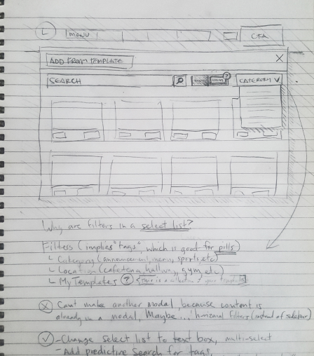
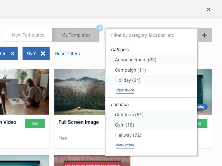
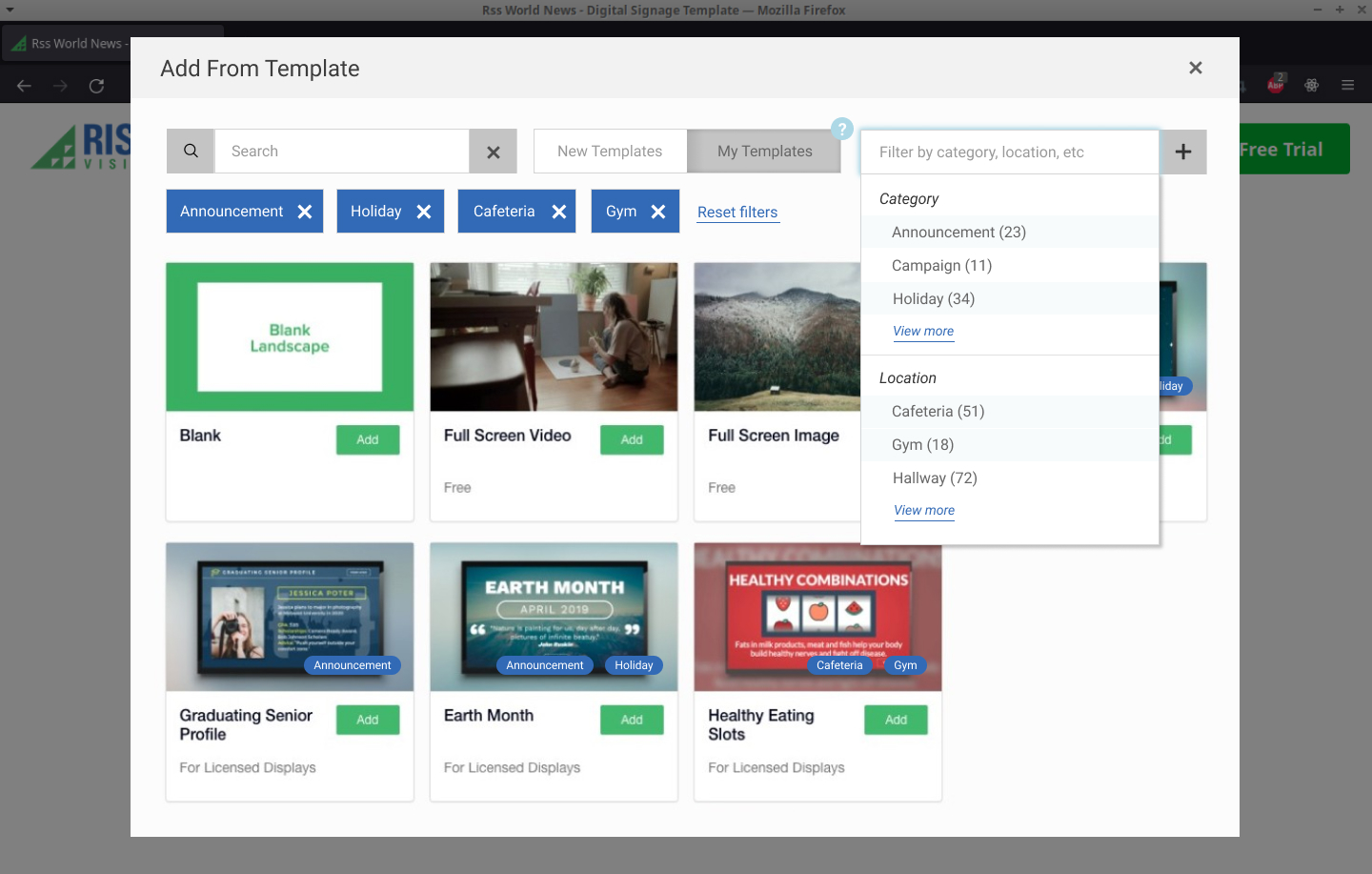
Template Library Multi-Select List

A Rise Vision Case Study

My Role

User Experience Design

Front-End Development

Team Members

Alex Deaconu, Lead Developer

Adi Turiya, Senior Developer

Objective

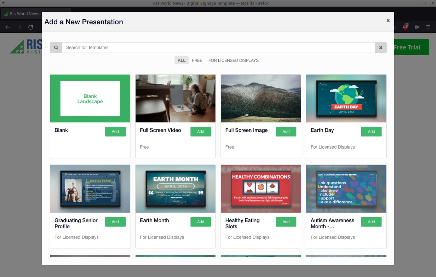
Allow users to toggle results in the Template Library to show only templates they've edited

Timeframe

1 Week

Rise Vision logo as background

Overview

Rise Vision makes digital signage software for schools and businesses. Their software is highly customizable and feature-rich. One thing that puts Rise Vision ahead of their competitors is that they offer thousands of templates to choose from, with more templates created every day.

Challenge

The problem with having such an impressive catalogue of templates is that it can be overwhelming to sort through. To compound this problem, the application saves user-modified templates back in the Template Library, along with all the default ones. With their customized templates getting lost in the Template Library, users were getting trapped in a cycle of creating new templates when they couldn't find the ones they were looking for.

A screenshot of the top of the Template Library window
A screenshot of the original search input

Solution

Our UX Research showed that users often need to specifically browse templates that they (or another member of their organization) had already customized with their branding. The Template Library search form would have to be adjusted to allow sorting edited templates from default ones.

After researching best practices for search form inputs, I drew several iterations of possible implementations for our new form field and where it would be located in the form. My team looked at the options and we decided to add a toggle (or checkbox) input next to the search field. It was the most intuitive and technically feasible solution to implement in the time that we had.

I knew users would want to search the templates similar to how they were already accustomed to doing it. To minimize friction, I made the search field the first parameter to the search form, then added the new toggle input as the second.

But after I completed the toggle input, my brain's wheels kept turning. I thought -- what if users could filter templates by tag? What would that look like?

I knew we would not have time to implement this feature now, but I allowed myself to keep exploring anyway.

This is why I work in design in the first place -- to exercise my creativity and see where my ideas take me!

It took an hour, but I completed the design for a third input to filter templates by tags. Although the design was ambitious, I knew that it could be done. In fact, we already had a tagging system in place. Filtering tags was the logical next step for a future iteration.

A scan of my sketchbook showing redimentary UI designs
A photo of my sketches & thought process

Testing

User Testing on the prototype showed us that the new toggle form field was intuitive from a functional standpoint. In fact, most of the feedback we received was regarding the language that was used to name the toggle options. We did more user testing to discover what words our users were actually using. The results were not what I had expected.

A screenshot of the new inputs
A screenshot of the Template Library window with the opened 'filtered multi-select list'

When users described their thought process aloud during testing, some would use words like “my” / “my company's”, “custom”, “edited”, and “branded” to differentiate their templates from the default ones. Similarly, users interchangeably used “new”, “default”, “generic”, and “un-edited” to describe the templates that had not been customized.

A/B Testing clarified the best wording options. We arrived at “New Templates” and “My Templates” as the most user-friendly labels to apply to our toggle input and adjusted our design to include these new findings.

Result

This was definitely a good project for a week-long sprint. With a narrow scope defined, the team was able to implement our solution in it's totality within the given timeframe.

As expected, the tag search input that I had designed did not make it out to production in time. Regardless, I am still glad that I took the time to explore it as an option. After all, the goal for the future will be to allow users to filter the templates by tags anyway. And now we have the prototype for it!

A screenshot of the Template Library window before improvements
Template Library Search -- Before
A screenshot of the Template Library window after improvements
Template Library Search -- After

Reflections

Things that went well

Given the time and technical constraint, the project did well to meet the intended goal. I felt good about my design for the category filter input, even though we could only implement the toggle input at this stage. User testing was instrumental in that it backed up our assumptions about the design of our input, but challenged us on our assumptions about accessible language.

Things I would do differently

Reflecting on my design, I would visually change the input style of the toggle to make sure it look unquestionably like a toggle input. The current design of the input is fairly flat, so it may not be immediately clear to users that it is a toggle. I am actually surprised that we didn't receive this kind of feedback in our user testing. If I were to do it again, I would borrow the toggle style that is often used in the settings panel of a phone. That would help solidify its recognizability.

Thanks for reading!

Let's Work Together!

I'm currently taking on new clients, and would love to hear about your project. Please include as much information as possible about the scope of your project, your timelines, and your budgets.

Send Me an Email